Here's something I see happen constantly: a brand launches with a beautiful calligraphic logo — refined, expressive, full of character — and then sets their entire website in the same script. Suddenly, what felt luxurious in the logo becomes unreadable in the navigation. What felt personal on packaging feels overwhelming on a product page.
The mistake isn't using a script font. The mistake is not understanding what each font category is for.
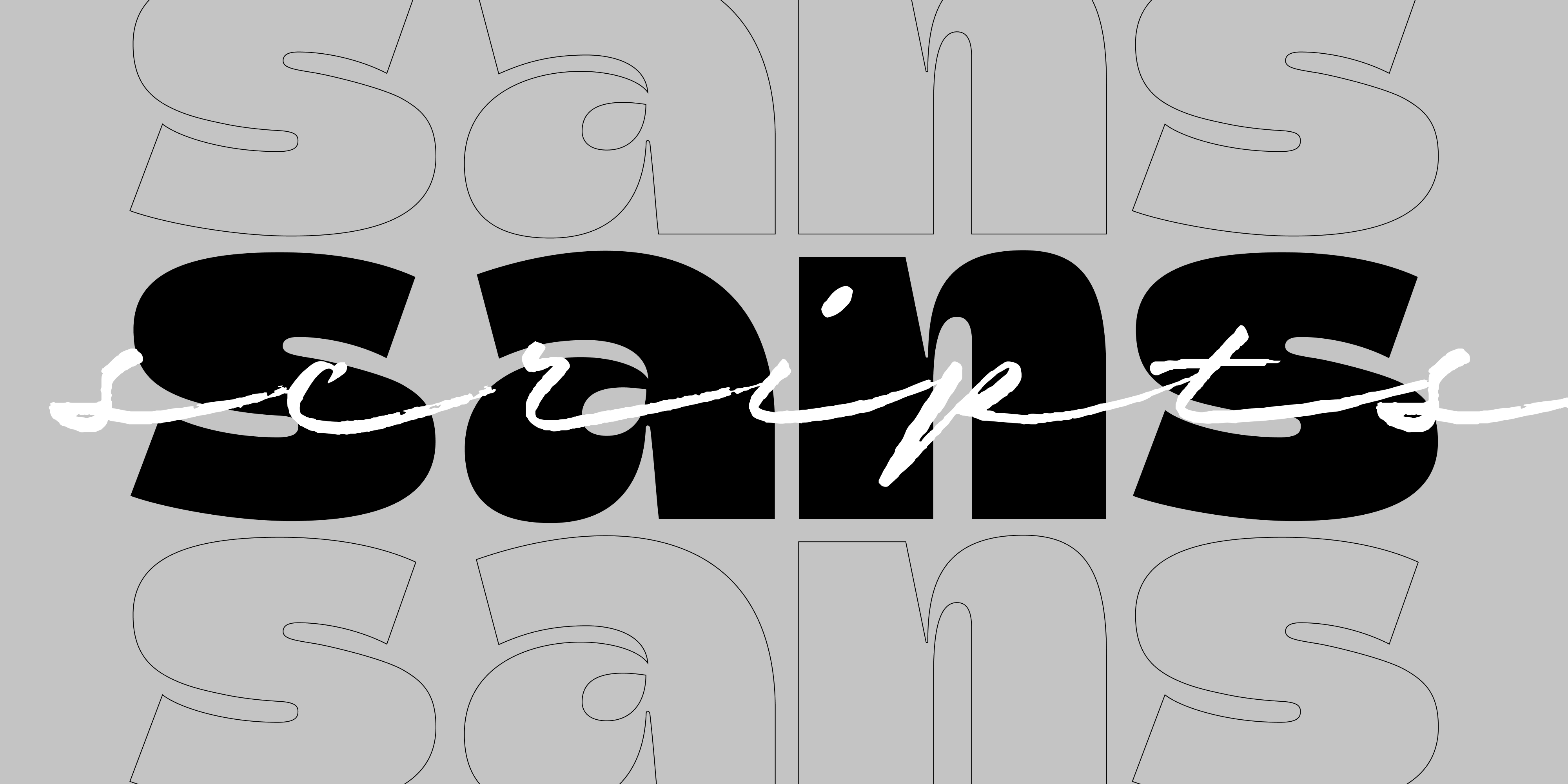
In branding, type doesn't just convey words — it sets expectations. Before a customer reads a single sentence, the style of your typeface has already communicated something about your brand's personality, values, and intended audience. Script and sans serif fonts are two of the most powerful — and most misunderstood — tools in that system.
Script Fonts: Not One Thing, but Three
When designers say "script font," they're actually talking about a family of very different tools. Understanding the subcategories is what separates effective type choices from generic ones.
Calligraphic / Formal Scripts
These come from the tradition of pointed-pen or broad-nib calligraphy. They carry weight, structure, and a sense of ceremony. Think fine spirits packaging, luxury perfume, heritage fashion, editorial covers. The visual language here is: this has been made by hand, with skill, and it matters.
When to use: High-end packaging, editorial logos, brands that want to feel timeless rather than trendy. Works especially well when paired with a neutral sans for contrast.
RSZ examples:
- Nautica — based on Copperplate's ductus, high in contrast with over 1,000 glyphs and ligatures inspired by brush pen strokes. Ideal for luxury cosmetics, premium food and beverage, or fashion labels that want presence without noise.
- Mina — an elegant cursive with long elastic connections between letters, clean thin lines, and the relaxed glamour of 1950s Mediterranean style. Eleven styles ranging from light to heavy, including calligraphic and shadow variants. Ideal for logotypes, packaging, and editorial contexts where calligraphy needs to feel refined but never stiff.
- Crispo — crafted through the delicate strokes of pointed pen calligraphy, where each character resonates with the eloquence of a precise brushstroke. A refined and enchanting script for contexts that demand calligraphic artistry at its most controlled.
- Oddity Script — a calligraphic script with reversed contrast, built on English calligraphy and the DNA of Nautica. The rule-breaking contrast inversion gives it a distinctive lo-fi nostalgia with a 70s flavour that feels genuinely contemporary. Exceptional in big titles, quotes, posters, and any brand that wants calligraphic roots with an unconventional edge.
Brush / Expressive Scripts
These fonts carry the energy of a loaded brush moving fast across the page — confident, physical, alive. The contrast between thick and thin strokes is dramatic, and the texture tells you something was made by hand, with intention. They feel bold without being loud.
When to use: Artisanal brands, food & beverage, beauty, fashion, publishing. Any context where handmade character needs to read at large sizes and photograph well on packaging.
RSZ examples:
- Adore You — created with a dry brush on paper, keeping genuine texture and the feeling of dry ink in the digitized strokes. Available in upright and slanted variants, with decorative stroke sets. Versatile across beauty care, food, fashion, health, and stationery.
- Timberline — drawn with a felt brush pen on smooth paper, then digitized to preserve the realness of handmade strokes. Graceful lines with genuine textural character. Comes with an Icons set of catchwords, ornaments, and doodles for richer layouts.
- Smoothy — urban, modern, and sign painting inspired, with a confident handwritten attitude. Works across headlines, posters, packaging, fashion, and cosmetics. Ligatures and stylistic alternates accessible via OpenType for further customization.
Casual / Handwritten Scripts
The most approachable of the three. These mimic everyday handwriting — relaxed, friendly, a little unpolished. They work best when a brand wants to feel personal and conversational. They're risky when overused: the category has become the default for a certain kind of generic "artisan" branding, so distinctiveness matters more here than anywhere else.
When to use: Lifestyle brands, social-first products, café and food concepts, anything targeting an audience that values authenticity and warmth over formality.
RSZ examples:
- Modern Love — hand-painted with a pointed brush and walnut ink, with high contrast density and a deliberately effortless feel. The family includes Grunge and Rough variants for vintage and textured effects, plus a handwritten caps companion. Works beautifully across headlines, packaging, cosmetics, and fashion — wherever expressive script needs range and depth.
- Hello Fresh — a bouncing, all-caps hand-drawn script with a playful, lively energy. Each font includes two alternates per glyph for natural rhythm variation. Effective for food packaging, labels, T-shirts, and any brand that needs to feel upbeat and unpretentious.
Display Fonts: Bold, Immediate, Unmistakable
Display fonts are built for one purpose: to command attention at large sizes. They're not meant to disappear into a layout — they're meant to be the layout. The best display typefaces have a strong point of view: a distinctive silhouette, an unusual proportion, or a structural logic that makes them instantly recognizable. Used well, a display font can carry an entire brand identity on its own.
When to use: Hero headlines, posters, packaging frontfaces, logotypes, any context where the type is the visual anchor.
When to avoid: Body copy, small sizes, UI contexts requiring sustained readability.
RSZ examples:
- Gotti — wide stance, flat serifs, and a sculpted contemporary feel. Delivers editorial elegance without fuss — ideal for minimal luxury brands, beauty, galleries, and fashion that want strength and sophistication without shouting. Set in large titles with generous tracking for maximum impact.
- Revolute — a sophisticated stencil display inspired by H. Brünnel's Resolut, designed for Fonderie Nebiolo in Turin in 1937. Clean lines and subtle curves create a balanced, harmonious stencil with a timeless aesthetic that blends historical influence with modern sensibility. Available as a variable font. Ideal for branding, signage, and any project that needs a striking display presence with genuine typographic heritage.
- Flipante — a variable display font with tubular shapes, ink traps, and juicy curves, spanning from ultra condensed to expanded. The width axis gives it exceptional flexibility — tight and compact for dense headlines, wide and bold for packaging heroes. Works across branding, packaging, and digital with equal confidence.
- Kiosq — born from tiki culture and mid-century sign painting traditions, with bold three-dimensional letterforms and distinctive drop shadows that leap off the page. The organic irregularities and authentic brush stroke character make it ideal for beach resorts, craft breweries, food and beverage, and any brand that wants vintage tropical warmth with confident contemporary energy.
Serif Fonts: Structure, Authority, and Editorial Depth
Serif fonts bring the weight of typographic history — but the best ones wear it lightly. In branding, a well-chosen serif communicates that a brand has substance behind its aesthetic: it's been thought through, it has roots, it will still feel right in ten years. High-contrast serifs in particular carry an editorial authority that no script or sans can replicate.
When to use: Brand logotypes, magazine covers, luxury packaging, cultural institutions, fashion editorial, book covers — anywhere a brand needs to feel both sophisticated and enduring.
When to avoid: Body copy at small sizes, UI contexts, or brands that want to feel casual or approachable.
RSZ examples:
- Turquoise — Roman Capitals drawn smoothly with a flat brush rather than carved. The unfinished terminal serifs and brushy nature-inspired ornaments give it a handmade warmth that purely typographic serifs lack. Ideally suited for headlines, packaging, and visual identities that need harmonious elegance with a distinctive artisanal quality.
- Norman — condensed and high contrast, with an oblique axis that adds contemporary energy to a classical structure. Fashion-forward and self-confident, Norman is built for big titles, magazine covers, and editorial contexts where the type needs to feel both refined and alive.
- Sidera — a high-contrast serif with a strong editorial voice, from delicate Thin to commanding Black. Sharp wedge serifs and flared terminals bridge classical beauty with contemporary design. Works across magazines, cultural publications, luxury packaging, and typographic identities.
Sans Serif Fonts: Equally Varied, Equally Misread
"Just use a clean sans" is advice that sounds simple but hides a lot of nuance. Not all sans serifs are the same — and choosing the wrong flavor can send completely the wrong signal.
Geometric / Modular Sans
Built on strict mathematical proportions and modular logic. These fonts feel precise, constructed, and confident — which can read as either visionary and forward-thinking or cold and clinical, depending on context. They're at home in tech, architecture, bold fashion, and any brand that wants to feel like it was designed with intention. When the modular structure carries an industrial weight — condensed forms, strong contrast between widths — the result is something more assertive than pure geometry alone.
When to avoid: Any brand that needs warmth or approachability. Geometric sans in a children's food brand or community healthcare context creates friction.
RSZ examples:
- Ordine — a modern geometric variable font built around perfectly circular counters, with refined details that avoid the sterility of purely mechanical geometry. The two-story g and the horizontal bar on the e signal sophisticated craftsmanship without compromising clarity. Lighter cuts work beautifully in editorial design; bold styles make a commanding statement in branding, sportswear, and cultural applications.
- Squadra — clean-cut, square-structured, with a modular logic that reads like pure design discipline. Bauhaus meets brutalism. Thrives in all-caps settings on packaging or posters that need no imagery to communicate authority.
- Industria Sans — modular and geometric at its core, but with an industrial character that sets it apart from purely abstract geometry. Its extensive range — Condensed, Regular, Wide, plus Back variants — makes it a highly scalable system for editorial layouts, app interfaces, and brand identities that need structural strength across very different contexts.
- Superpop — a rounded geometric sans with an unexpected brushy script twist. Soft and refreshing, it mixes geometric letterforms with script-influenced shapes you wouldn't expect in a sans serif. Available as a variable font with 5 weights, italic, and outline versions — ideal for food, drinks, youth brands, and any project that wants geometric structure with personality and warmth.
- Annuario — a large sans serif family with a brushy look, originally designed for a calendar. 48 fonts across 2 variable axes (weight and width), from Condensed to Expanded. The handmade touch in the strokes gives it character that purely geometric sans fonts lack, while the extensive range makes it highly adaptable for headlines, editorial, and branding.
Humanist Sans
The warmest of the sans category. Humanist sans serifs have roots in calligraphy — the strokes vary slightly in weight, the letterforms breathe. They're legible at small sizes, adaptable across mediums, and feel approachable without being casual. This is the workhorse of most branding systems that need to work both in print and on screen.
When to use: Healthcare, lifestyle, publishing, editorial, fashion — any brand where the type needs to carry both warmth and credibility simultaneously.
RSZ examples:
- Turquoise Sans — though classified as a sans-serif, it carries a subtle swelling at the terminals inspired by classical Roman capitals. That calligraphic DNA gives it warmth that purely geometric sans fonts lack, making it ideal for brands that pair it with its script companion, Turquoise.
- Performa — a comprehensive family that bridges grotesque and geometric philosophies across 108 fonts, from Compressed to Wide. Its controlled proportions and extensive range of weights make it one of the most adaptable tools in the RSZ catalog, equally at home in fashion editorials, brand systems, and UI contexts.
Grotesque / Neo-Grotesque Sans
The default of Swiss modernism — neutral, rational, industrial. These fonts don't express personality so much as remove it, which is itself a statement. They work brilliantly for brands that want to feel confident without being loud, and for any context where readability across large character sets and complex layouts is non-negotiable.
When to use: Tech platforms, publishing, corporate identity, signage, editorial design, UI systems.
RSZ example:
- TotalBlack — explicitly inspired by classic grotesk typefaces, with 9 weights plus italics and a Display variant. Clean, neutral, and strong — suited to logos, magazines, and any project that needs a serious and versatile typographic foundation.
The Real Decision: Emotional Temperature
One useful way to think about all of this: script and sans fonts exist on a spectrum of emotional temperature. Formal calligraphic scripts are warm and ceremonial. Casual scripts are warm and relaxed. Geometric sans are cool and precise. Humanist sans are warm-neutral. Grotesque sans are cool-neutral.
Before you choose a typeface, ask: what emotional temperature does this brand need to operate at? A fintech app that wants to feel trustworthy but not cold might land at humanist sans. A premium spirits brand that wants to feel luxurious but not stiff might land at a formal calligraphic script paired with a clean grotesque. A natural beauty brand might want the dry-brush expressiveness of Adore You or Modern Love paired with the classical warmth of Turquoise Sans.
Combining Script and Sans: The Discipline of Contrast
The most powerful branding systems often use both — but not randomly. The key is contrast with intention. Script and sans should divide labor clearly: script draws the eye, sans carries the information. When both compete at the same visual weight, neither wins.
Common and effective ways to split the roles:
- Logo in Script + UI, navigation, body copy in Sans
- Product name in Script + Ingredients, legal text, back panel in Sans
- Headline or pull quote in Script + Article body in Sans
Pairings that work well together:
- Nautica + Turquoise Sans — a natural pairing recommended by the foundry itself: the formal calligraphy of Nautica finds a perfect counterpart in Turquoise Sans, which shares the same classical Roman roots in a sans form.
- Adore You + TotalBlack — dry-brush expressiveness paired with clean grotesque neutrality. The handmade energy of the script is anchored by the rational confidence of the sans.
- Mina + Performa — Mediterranean calligraphic elegance alongside a versatile sans family that covers every weight and width. Effective for editorial, fashion, or any brand system that needs to feel refined across both display and text sizes.
- Timberline + Ordine — expressive brush energy balanced by clean, digital-first geometric precision. The textural handmade quality of Timberline finds a confident counterpart in Ordine's refined contemporary geometry — effective for food brands, lifestyle products, or any project that wants to feel both crafted and modern.
When Script Goes Wrong
Over-relying on script as a personality shortcut. In certain sectors — wellness, bakery, "artisanal" food — script fonts have become so ubiquitous that they no longer communicate anything distinctive. If every competitor uses a brush script, using one too is not a brand choice; it's camouflage.
Setting long text in script. Script fonts are display tools, designed for short bursts at large sizes. Setting more than a line or two — especially at small sizes — creates legibility problems and visual fatigue fast.
Choosing based on aesthetics alone. The subcategory matters. A formal calligraphic script on a streetwear brand creates dissonance. A casual handwritten script on a prestige hotel feels like a downgrade. Match the script's heritage and character to the brand's world.
Ignoring digital contexts. A script that looks stunning in print can become unreadable on screen at 14px. Always test your typeface choices across both environments before committing.
Quick Reference
Calligraphic Script — Ceremonial, luxurious. Best for luxury packaging, heritage brands, editorial logos. Avoid for UI and body copy. RSZ fonts: Nautica, Mina, Crispo, Oddity Script.
Brush Script — Energetic, expressive, handmade. Best for beauty, food & beverage, fashion, artisan brands. Avoid in formal corporate contexts. RSZ fonts: Adore You, Timberline, Smoothy.
Casual Script — Friendly, personal, approachable. Best for lifestyle brands, cafés, social-first products. Avoid for premium or prestige positioning. RSZ fonts: Modern Love, Hello Fresh.
Display — Bold, immediate, unmistakable. Best for hero headlines, posters, packaging frontfaces, logotypes. Avoid for body copy and UI. RSZ fonts: Gotti, Revolute, Kiosq, Flipante.
Serif — Authoritative, elegant, editorial. Best for brand logotypes, magazine covers, luxury packaging, fashion, cultural institutions. Avoid for body copy at small sizes and UI. RSZ fonts: Turquoise, Norman, Sidera.
Geometric / Modular Sans — Precise, constructed, confident. Best for tech, architecture, bold fashion, editorial. Avoid where warmth or community feel is needed. RSZ fonts: Ordine, Squadra, Industria Sans, Superpop, Annuario.
Humanist Sans — Warm, credible, versatile. Best for fashion, publishing, lifestyle, healthcare. Avoid in ultra-minimal or clinical contexts. RSZ fonts: Turquoise Sans, Performa.
Grotesque Sans — Neutral, rational, clean. Best for UI, corporate identity, publishing, signage. Avoid for emotional storytelling. RSZ font: TotalBlack.
Questions about font pairing for your brand identity? We're happy to help: info@resistenza.es