A Guide for Designers, Agencies & Brands Who Take Typography Seriously
Typography is more than decoration — it's a core visual language. In a world where millions of fonts are available for free, knowing which ones are truly professional-grade is a practical, strategic skill. Using a poorly designed font can undermine your brand's credibility, break your design system, or create legal liability.
Let's dive into the 7 qualities that define an industry-ready typeface — and how to spot them with confidence.
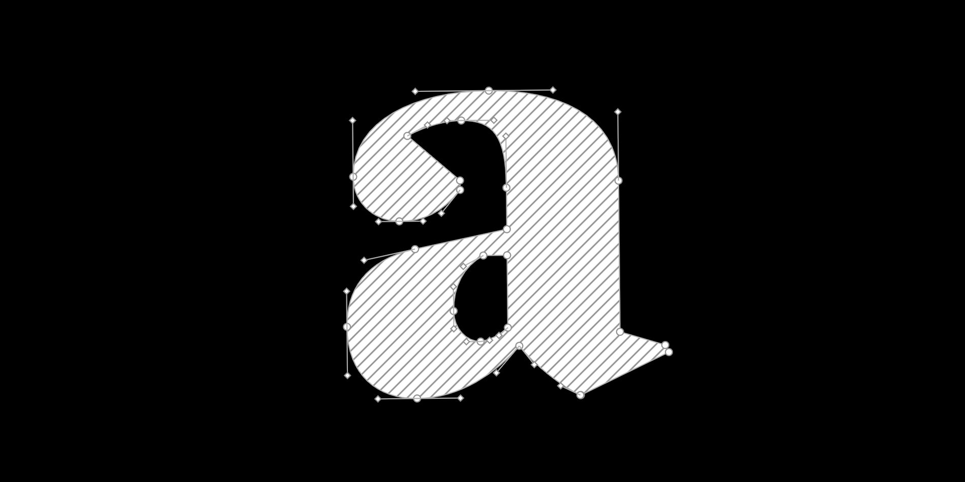
1. Optical Harmony & Proportion
Professional fonts are designed by type designers — not just graphic designers. Every glyph is drawn with attention to rhythm, weight distribution, and visual balance. Proportions are fine-tuned across the entire character set, not just on a handful of showcase letters.
The result is typography that reads consistently and elegantly in real-world use — whether in a logo, a body text block, or a large-format print.
Without optical refinement, expect:
- Uneven spacing that undermines logos and headlines
- Wobbly letterforms under close inspection or large-scale use
- Interrupted reading rhythm in body text
RSZ Type Example: Norman is built around optical refinement. Its warm, humanist proportions make it work equally well in branding and extended editorial use.
2. A Coherent Typographic System
Amateur fonts often exist in a single weight: Regular. Professional fonts are part of a type system where every weight — Light, Regular, Bold, Black — is optically harmonized through a shared designspace. They are not arbitrary variations; they are calculated interpolations that maintain consistent stem contrast, spacing, and proportions across the range.
True italics are equally essential. A professional italic is not a mechanically slanted roman — it is a separately drawn style with its own axis, different letterform structures (especially in the lowercase a, f, and g), and a slightly condensed rhythm.
Multiple styles allow brands to build typographic hierarchy — contrast between weights that communicates structure without ever switching fonts.
RSZ Type Example: Annuario Variable delivers a full weight spectrum in a single file via variable font technology — allowing precise tuning for every platform and context without leaving the type family.
3. Advanced OpenType Features
Professional fonts are smart. OpenType programming adds a layer of typographic intelligence that goes far beyond the basic character set:
- Standard ligatures (liga): substitute common glyph pairs like fi and fl to eliminate optical collisions
- Contextual alternates (calt): swap glyphs based on surrounding characters for more natural-looking text
- Stylistic sets (ss01–ss20): offer curated alternate letterforms for different typographic moods
- Swashes, small caps, old-style figures, tabular numerals: tools for refined editorial and branding typography
These features are invisible when absent, but transformative when present.
RSZ Type Example: Nautica and Timberline are dense with smart features — ligatures, alternates, and swashes that allow typographic expression with a crafted, non-generic feel.
4. Multilingual Character Set Coverage
A professional font does not stop at A–Z. It includes the full range of diacritics and accented characters for Western, Central, and Eastern European languages, proper punctuation (true quotation marks, primes, ellipsis, dashes), currency symbols, and multiple numeral sets:
- Lining figures: uniform cap height, ideal for tables and UI
- Old-style figures: varying height for natural flow in running text
- Tabular figures: monospaced width for aligned data columns
Broad language support is critical for brands operating across multiple markets. A font that cannot handle Polish, Czech, or Romanian breaks the moment you localize.
RSZ Type Fonts: Resistenza Type fonts fully support Western, Central, and Eastern European languages and include OpenType numeral options — allowing you to build multi-market identities without font switching.
5. Meticulous Kerning & Spacing
Kerning is invisible when done well. It is glaring when it is not. Professional fonts are kerned manually by the designer — pair by pair, considering the specific shapes involved, not just applied by an automated algorithm.
Good spacing begins with solid sidebearings — the white space built into each glyph — which means the font reads correctly even before any kerning pairs are applied. Kerning then refines the most critical combinations, especially those involving diagonal letters like V, A, W, and T adjacent to open or rounded forms.
The result is text that flows naturally at any size, from 8pt captions to 200pt headlines.
RSZ Type Example: Try Squadra set in all-caps to see how tight, hand-crafted kerning creates strength and visual cohesion in branding applications.
6. Production-Ready Formats & Technical Quality
A professionally released font ships in the right formats for every context — and each format is properly optimized, not just converted:
- OTF / TTF for desktop use — print, design applications
- WOFF / WOFF2 for web, with subsetting and compression for fast loading
- Variable fonts — a single file replacing entire families, with compressed file size and smooth interpolation across the full design range
Technical quality also means clean outlines, correct hinting, well-structured GSUB/GPOS tables, and a properly defined STAT axis table in variable fonts — details invisible to the end user but critical for cross-platform rendering.
RSZ Type Fonts: Resistenza Type delivers web-optimized WOFF2 files, print-safe outlines across all weights, and variable fonts with full compression benefits and complete design range coverage.
7. Clear Licensing & Foundry Support
This is where many free or low-cost fonts fail silently. Professional font licensing means:
- Clearly tiered EULAs covering desktop, web, app, broadcast, and embedding use
- Transparent pricing based on actual usage metrics — pageviews, users, employees
- Responsive foundry support for troubleshooting, upgrade paths, and custom needs
- Ongoing maintenance: updates, bug fixes, expanded glyph coverage over time
Using an unlicensed font in a commercial project creates real legal exposure. Using a font outside the scope of its license — even an otherwise legitimate one — is equally risky. This matters especially for brands embedding fonts in apps, digital publications, or broadcast media.
RSZ Type: Resistenza Type offers a transparent, tiered licensing structure built for real-world usage — with direct support for licensing questions, custom font needs, and upgrade paths. Read our licensing guide →
In Summary: What Makes a Font Professional?
- Optical precision & proportion: Carefully drawn and tested across all glyphs
- Systematic weights & true italics: Not just a Regular — a full, coherent type family
- OpenType features: liga, calt, stylistic sets, small caps, figure variants
- Multilingual character coverage: Western, Central, and Eastern European at minimum
- Hand-crafted kerning & spacing: Manual attention pair by pair
- Production formats: OTF, WOFF2, variable font ready
- Clear licensing & foundry support: Legal, tiered, documented, backed by real people
Buy Fonts Like You Buy Professional Tools
Would you use a low-resolution stock photo for a high-end brand campaign? Or free icon sets in a multi-million-dollar product?
Professional fonts are design infrastructure. They carry weight across every touchpoint: reading flow, brand tone, system coherence, user trust, and legal safety. Investing in a well-built typeface means investing in the reliability of everything it touches.
Explore our most complete type families:
Need help choosing or licensing a font for your project?
Write us: info@resistenza.es